It’s no secret I have a love of data.
Data driven design and feedback-based iterative changes… these are a few of my favourite things (don’t worry I’m not going to start singing The Sound of Music).
It’s one thing to tell you this is how (I think) you can get the most bang for buck when making changes to your site, but it’s another to show you how. So rather than talking about concepts, I thought I’d introduce you to a few of the programs I find really helpful in turning that data into valuable, actionable(!) information.
Inspectlet is a great tool for understanding how people use your website. It records the real-life actions your users are performing, so you can watch exactly what someone is doing on your website.
Are they spending a long time on a particular page because they’re engaged in the content, or because they can’t find what they’re looking for? Do you want to see what parts of a particular page are most engaging? Maybe you have to choose between two images, and would rather get user feedback on what is more eye-catching. Not only does Inspectlet record user sessions, it can give you heatmaps, like the example below, to help you out.

I personally think that tools like Inspectlet really give you an edge in making sure you’re giving people what they really want, and not just what you think they want. All without needing to interrupt your users.
Inspectlet is not the only tool of its kind, so it’s worth having a poke around to see what’s going to work best for you.
Google Analytics is probably one of the first things most people will turn to when seeking out data about their website. It’s an extensive, robust tool, and there’s a lot in there that’s incredibly useful. Aaron has done a blog on GA to give you a leg up if you’re new to the Analytics space.
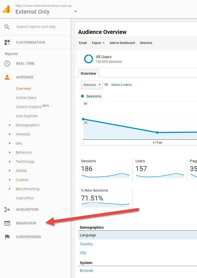
For this blog, I wanted to point out a particular feature. On your Analytics home page, click that little ‘Behaviour’ option on the left hand side:

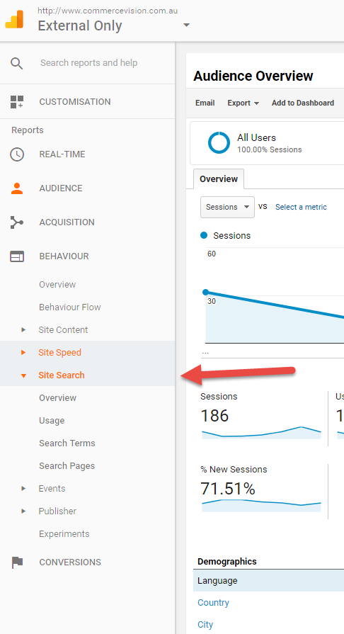
When the Behaviour menu expands, you’ll see a bunch of really useful data that GA have already turned into information for you:

Personally, I find the Search Terms data especially helpful. You can see at a glance what visitors commonly look for on your site. As far as delighting your customers goes, placing these products front and centre (whether via a new campaign, or optimising them for search) is an excellent way.
The last one I wanted to show you is a little different.
BrowserStack is a product designed to help you test your site on different browsers and across multiple devices. I’ve used it pretty extensively, especially in previous roles when I wore my QA Tester hat, and I’m quite a fan. In terms of being able to see what different images and content will look like across devices, I find it (and platforms like it) efficient and oh so helpful.
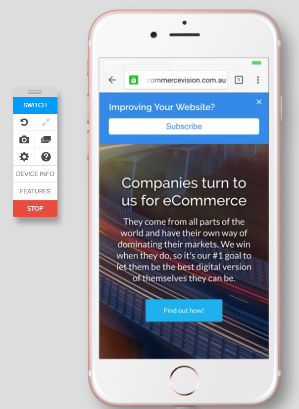
For example, this is a quick look at how the CV site would look specifically on an iPhone 6:

Unlike just resizing your browser window, this connects you to an actual device and allows you to get a completely true representation of the site. Pretty neat, huh?
Well, with that I’ve finished my coffee so I’ll wrap things up.
I’d love to hear what you’re thinking of these blogs so far. Would you like more detail, less detail? Let me know!
Until next time!
