Welcome back to the wide world of website search. It may not be quite as much fun as other parts of the internet (like cat videos) but hopefully you’ll still get something out of it.
Before I dive into today’s post I wanted to give you a really quick recap on part one of this post. To break it right down we covered off on these concepts:
- Search should look how users expect search to look
- Searching by product code and/or product name
- Autocorrected searches (sometimes called “Did you mean” or “Suggested”)
- Searching by alternative SKU’s / names
- Auto populate search suggestions
Since we’ve covered off on the what in my last post, let’s get cracking on the how.
- Making a duck look like a duck
In my original blog post I mentioned some good fundamentals to stick with when looking at designing your search and where it’s going to live within your website. Like most things with the web there’s very few hard and fast rules. But there are a lot of great guidelines.
Rather than me throwing a wall of text at you I thought I’d show you a couple of examples of search.

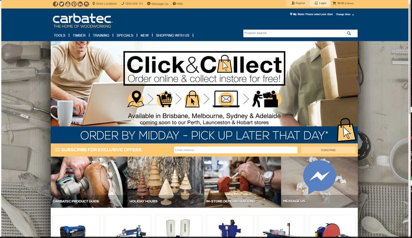
Carbatec’s search is towards the top right hand side, and has the obvious indicators that it’s an editable field. In this instance that includes both a widely recognised search icon (the looking glass) and grey scale text as a prompt for users.
As a bonus this particular search will travel with you as you scroll down the page so it’s always there if you’re reminded of something you need by the content on their home page.

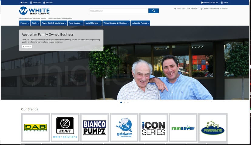
By contrast White International place their search in the top middle of the home page. The exact placement is really a business preference and can be dependent on customer base.
You’ll notice the clear communication to users that this is a search bar. Both an easily recognised search icon and a light coloured font with a text hint. The specific icon that will be the most effective can vary depending on your customer base. I’ll always recommend doing your research to see what resonates most with your users.
- Helping people who know exactly what they want
Next on the agenda for this post is product codes. While this may not be hugely relevant within the B2C space a lot of B2B customers will be reordering the same products often enough that they get to know some of your SKUs. Giving these users exactly what they want in the way that they want it is a great way to earn customer brownie points.
To set this one up there’s a few steps you’ll need to take:
- Login to the CMS
- Advanced Settings
- Select Lucene Search Settings
- Select Index Settings
- Ensure “Perform Partial Word Searches” is enabled (this will allow customers to see results that do not have an exact match, for example if they have a habit of dropping the leading 0 on a product code)
- Select Index Fields
- If Product.ProductCode is not listed as a Source:
- Select New
- Enter an identifiable name for you
- Set your source to [Product.ProductCode] (this assumes you use standard product codes and behaviour – if not feel free to contact me)
- Set “Allow Contains Search” to “Yes”
- Save your new source type
- Your changes won’t take effect immediately.
- You can reindex Lucene by selecting the Recreate Index checkbox on the “Indexing” tab. However, this will have an effect on the results returned while it’s reindexing so consider the time of day before you do this.
- You can also wait until the following day. Lucene is reindexed each night so if you’re happy to wait the day you can leave it and it will be ready for you tomorrow.
- Celebrate… with cake.
- Helping people who know almost exactly what they want
So, next on our list is word translations. Some people call them “autocorrect”, some people “suggested”, and others “did you mean”. They all effectively do the same job; provide users with translations that are specific to your products.
This one is a great one to do in conjunction with your analytics data. Under Behaviour in your Google Analytics account you can actually see what your most common search terms are. Check these out and see if you have any common drop offs you can identify. For example, you may have a range called “TipTopz” but you users keep searching for “TipTops”. Adding in a translation for this can teach your users the correct spelling without negatively impacting on their buying journey.
To add in a translation, we’re going to go back our handy list:
- Login to the CMS
- Advanced Settings
- Lucene Search Settings
- Translations
- Select New and enter your new translation
- Save (and maybe celebrate with more cake)
- What’s yours is mine and what’s mine is mine also
In my last post I mentioned the idea of a user being able to search using a competitor’s SKU. If you have products that are frequently purchased from multiple businesses (consumables is a great example) helping a user out by serving them up what they want even when they give you a competitor’s SKU can give you an edge. Even with the wrong information you give them what they need and they can continue on the buying journey uninterrupted.
If you only have a couple of high value products that you want to do this for and you don’t currently store competitor SKUs, a simple way to do it is with a translation. You can follow the process listed above. Except this time instead of misspelt words you just translate their SKU to yours.
An alternative method is if this information is stored in your Pronto already. In that case you’d follow the method I mentioned earlier for adding a SKU as a searchable parameter. But instead of the Source being the standard Product.ProductCode this would be the field you store the alternative SKU in. Best to have a quick chat to us to make sure this field is integrated before you start so we can point you in the right direction for naming conventions etc.
- Are we there yet?
One last one for you and then I promise I’ll stop talking. The final thing I recommended in the previous post was around auto-populated suggestions. The great news is if you’re on BPD this is super simple to set up.
You’ll need to find your search widget in the CMS – normally it’s in the Theme Layout but it could vary depending on your site design. Once you’ve selected to edit the widget select “Use Product and Search Suggestions” checkbox and presto! High five time!

Phew! Thanks so much for sticking with me. I really hope there’s something useful for you in here. If you have any questions, suggestions, or just miss talking to my lovely (modest) self, please feel free to give me a buzz.