Have you ever tried to explain a colour without using its name? No? Give it a go.
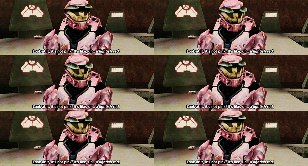
© Red vs Blue
Pop quiz: How many shades of blue do you think there are?
Answer: Depending on your definition, there’s somewhere between 26, 250, and an almost infinite number.
… That wasn’t a very useful answer was it?
Which brings me to the point of today’s blog post: image tagging and product variants. That’s a mouthful isn’t it? How about we change that to “Showing a customer what they’re buying”.
I’ve spoken about Product Variants before but they’ve gotten even more love recently.
So why am I talking about product variants again? Well, when combined with image tagging they let a user see exactly what it is that they’re buying.
Product Variants
So what happens when you don’t have colours but do have multiple products that are the same except for one or two minor variations? Well it’s not just about the user. You can use product variants to combine those products into a single listing (which means you only have one product page to maintain and no worries about duplicate content).
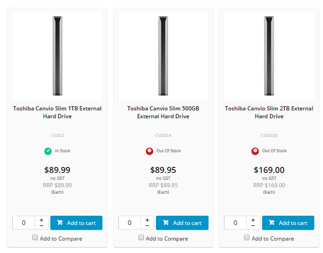
Conveniently, it does actually have a good impact on the user as well. Instead of seeing something like this, which just feels like a lot of unnecessary clutter:
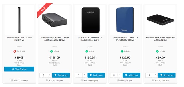
You could show them something like this:
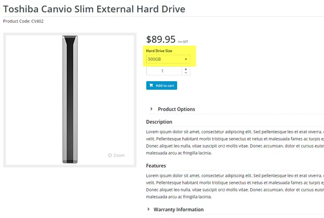
And let them drill down to the exact model they want on the detail page:
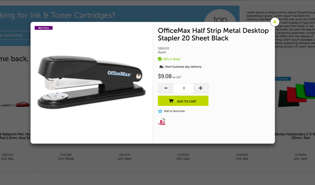
Utilising the product list Quick View, you could even bring that buying decision one level up and allow them to choose the exact product via the quick view and add it to cart – all without leaving the product list page. Like this:
If you’ve got products that could benefit from this sort of set-up, check out our documentation on Product Variants here.
Image Tagging
It’s all well and good to tell someone you have a shirt in red, black, and blue but what exactly do you mean when you say “blue”? Royal blue? Navy blue? Cambridge blue? It’s a whole lot easier to just show them. But in the spirit of delighting the customer, rather than just servicing them, let’s go one further. Instead of forcing them to flick through the 5+ product images you have to find which one they think you mean when you say “blue” do the work for them. By tagging the image with the appropriate variant, the product image will switch automatically when they select the appropriate option. Like this:
If you’d like to try it out for yourself, check out the CV Connect article here.
It all comes back to what I’ve spoken about previously: giving a user exactly as much information as they need to make their buying decision, and no more.
So what do you think? Do you like variants, hate them, or have no strong feelings whatsoever?

